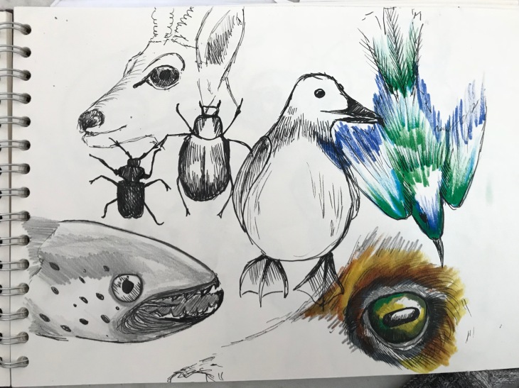
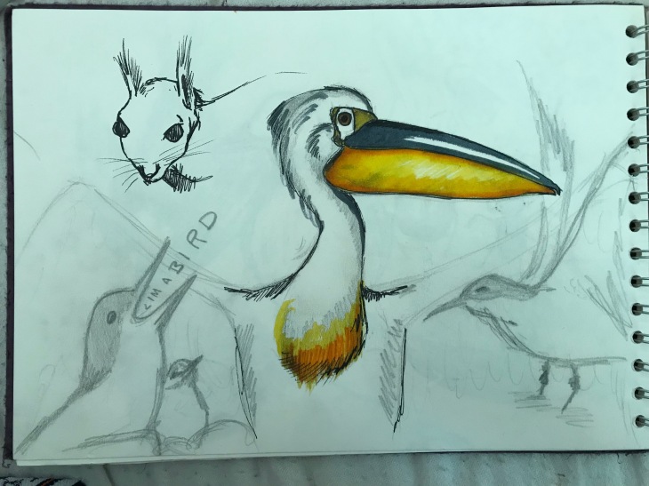
Common beasts found in a Bestiary


Lion

http://www.historyextra.com/article/feature/beasts-wonder-reading-animals-middle-ages

http://bestiary.ca/beasts/beast78.htm

The lion is considered the king of beasts, and is usually the first animal described in a bestiary. Some of the characteristics the lion is given is that it always sleeps with it’s eyes open (a symbol of how Christ slept corporally on the cross but kept his divinity awake, just as the lion sleeps but never lets his guard down entirely). They give birth to dead cubs but after three days the father roars and they come back to life, like the resurrection of christ.

In more modern tellings these ideas have persisted, Aslan in ‘The Lion the Witch and the Wardrobe’ sacrifices himself only to be resurrected again. A lion is also referred to as ‘the king of the jungle’.

e9862357c7054885e6e380c795d8c7fb

Unicorn

http://bestiary.ca/beasts/beast140.htm

It is often described as a small goat, ass or horse with a single horn on it’s head. In the ‘Pliny the Elder’ (1st Century) description it says ‘It has the body of a horse, the head of a stag, the feet of an elephant, the tail of a boar, and a single black horn three feet long in the middle of its forehead’. It is the enemy of the elephant, and kills it by wounding it’s belly. The only way it can be captured is of you trap it with a virgin girl. It represents Christ, it’s horn a symbol of the unity between christ and god. It is very difficult to capture which represents Christ’s ability to stay away from hell and evil.

It is sometimes called a ‘monocerus’, and is believed to be based on the Rhinoceros.

Manticore

http://bestiary.ca/beasts/beast177.htm

https://en.wikipedia.org/wiki/Manticore

http://mistholme.com/dictionary/man-tyger/

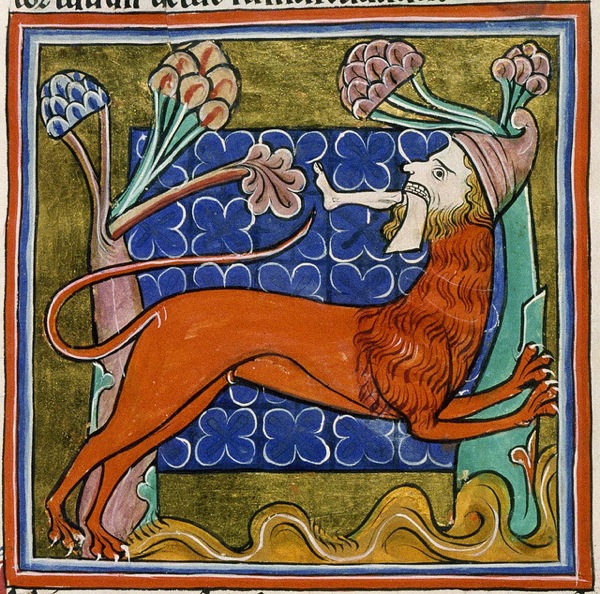
‘The manticore is a composite beast from India, with a blood-colored lion’s body, the face of a man with blue eyes, and a tail resembling the sting of a scorpion. It can leap great distances and is very active. It eats human flesh. Its voice is a whistle that sounds like a melody from pipes. Some say it can shoot spines from its tail.’

One of the stranger bestiary creatures, it has the face of man and the body of a lion, some stories saying it has three rows of teeth and lives off human flesh. It is of Persian origin, and probably came from a description of a tiger that has got a bit out of hand.

Manticore

It is sometimes referred to as a Mantyger, but sometimes these are two different things. ‘The man-tyger is a monster, consisting of a lion with a human head; sometimes the feet have been replaced by human hands.  It’s been suggested [Dennys 116] that the monster is an heraldic representation of the baboon of nature:  the cant with Babyngton, who used the man-tyger as a badge in 1529, supports this theory.  The man-tyger is very similar to the manticore, and may be considered an artistic variant.’ It also has links to the sphinx in it’s nature.


What is a Bestiary?

“A bestiary is a collection of short descriptions about all sorts of animals, real and imaginary, birds and even rocks, accompanied by a moralising explanation. Although it deals with the natural world it was never meant to be a scientific text and should not be read as such. Some observations may be quite accurate but they are given the same weight as totally fabulous accounts. The bestiary appeared in its present form in England in the twelfth century, as a compilation of many earlier sources, principally Physiologus. A great deal of its charm comes from the humour and imagination of the illustrations, painted partly for pleasure but justified as a didactic tool ‘to improve the minds of ordinary people, in such a way that the soul will at least perceive physically things which it has difficulty grasping mentally: that what they have difficulty comprehending with their ears, they will perceive with their eyes’ (Aberdeen MS 24, f25v).” (1)

A bestiary is a collection of beasts (both mythical and real) that have been given some kind of moral lesson or religious connotation. The roots of these stories and creatures date back to before we started recording things in writing, to Indian, Jewish and Egyptian legends. The Bestiary as we know it appeared around the 12th Century in England, based on a greek text called Physiologus. This was a collection of beasts, birds and fish with elaborate illustrations. Nearly all of the animals in this original text were North African in origin, European animals didn’t appear till much later.

Part of the reason a bestiary has such a moral message is because when it was written it was believed that God had put animals on this planet to learn from them, “But ask the animals, and they will teach you, or the birds of the air, and they will tell you; or speak to the earth, and it will teach you, or let the fish of the sea inform you. Which of all these does not know that the hand of the Lord has done this? In his hand is the life of every creature and the breath of all mankind.” (Job 12:7-10) (2). From the Physiologus greek version came Etymologia in the 7th Century by Isidore of Seville. These two books combined to create a version of the Bestiary we would recognise today. It is not a zoological or religious text, but rather a reflection of our world and how we interpret it.

Many of the illustrations were not accurate, as often the artist had never seen the animal they were depicting. They were a combination of writing, description, and other drawings of the animal. For example, ‘medieval European illustrators often drew the crocodile as a dog-like beast , the whale as a large, scaled fish, the ostrich with hooves and many serpents with feet and/or wings.’


  1. https://www.abdn.ac.uk/bestiary/what
  2. http://bestiary.ca/intro.htm

Finished essay and bibliography

How has Adam Elliot’s used colour in his 2003 short film ‘Harvey Krumpet’ and his 2009 full length film ‘Mary and Max’?

Adam Elliot is an Australian animator born in 1972, and has received over 100 awards, including an Academy Award for his 2003 film ‘Harvey Krumpet’. (IMDB, 2017) Elliot has said that ‘so much animation is cluttered with colour and movement’ (Australian Film Commission, 2004), and consequently both films have a minimalist quality. Elliot is known for coining the term ‘clayography’, a combination of ‘clay’ and ‘biography’. Both ‘Harvey Krumpet’ and ‘Mary and Max’ have a similar biographical tone, the stories over shadowed by an omnipresent narrator. ‘Harvey Krumpet’ follows the story of its eponymous character from birth to the end of his life in a home for Alzheimer’s patients; it is a bitter sweet story that explores the idea of life, death, and seizing opportunity while you can.

‘Harvey Krumpet’ was Elliot’s first venture into colour, as all previous work had been in black and white. It is also when he was able to extend the length of his animation, his first three films being 5 minutes and ‘Harvey Krumpet’ extended to 23 minutes. Elliot has said that he ‘let’s the characters tell him how long their story should be’ (i8Media, 2009), which allowed ‘Harvey Krumpet’ to explore the use of colour and character with more depth and detail than before. Elliot said in an interview that ‘all our lives are full of contradictions and absurdity from one time or another’ (Australian Film Commission, 2004). This shows in his use of colour, it has moments of absurdity (for instance in his dream sequence as seen above) that resonates with the confusion that the character is feeling. In the final 5 minutes of the film Harvey is in a retirement home for Alzheimer’s patients, rain hitting the window as the narrator poignantly says ‘time drizzled on’ (fig. 1). The colours are red and yellow but have been worn down with time, making them dirty and grey. The room is dimly lit, suggesting the light is fading from their lives as they slowly loose themselves.

We then have a fade transition from Harvey’s face with his eyes moving in a confused state (fig. 4) to him smiling and happy (fig. 5). The sound changes from a monotonous clock ringing and the rain hitting the widow, to a happy, humorous song, ‘God is better than football’. The colours used for this sequence are brighter and bluer, with flashing bulbs and a light, ethereal background (fig. 2 and 3). Although it is happy, the absurdity of it reminds us that it is just a dream, and Harvey will soon be back to his life of darkness.

Six years after the release and subsequent acclaim of ‘Harvey Krumpet’, Elliot created ‘Mary and Max’. This follows the lives of two pen pals, Mary is a young girl, and Max a 45-year-old man with Asperger’s. It discusses the themes of love, life, sexuality and growing old. In an interview Elliot said, ‘When I was starting out the equipment we needed cost hundreds of thousands of dollars’ (i8Media, 2009). After the success of his previous films the budget for ‘Mary and Max’ was much larger. I think this can be seen when watching the film, it is much more polished and cinematic. It is also his first film that explores two characters in great detail, ‘it is still biographical but it’s really about two lead characters’ (ACMI, 2015). This gives a more obvious opportunity to explore the contrast between two colours.

Elliot has said ‘I really wanted to use colour as a device in this film a lot more than I had in my previous films. I quickly worked out that if there are these two worlds we should really separate them by colour and of course New York is a very concrete place, a grey world. Australia in the 70s to me was very brown’ (Buckmaster. L, 2009). We are first introduced to Mary, one of our protagonists. We begin with a birds’ eye view shot, zooming in to a sign that give us a sense of geography and context (fig. 6). The colours are yellow, dusty and muted, a sense of heat and drought. We are then shown a series of objects, such as lawn ornaments and letter boxes, that decorate the dry, yellow gardens of the towns citizens. These are significant in showing the downfall of a once prosperous town, there is a sprinkler system, although there is a no water (fig. 8), and a bin full of litter even though we are told it is a ‘tidy town’ (fig. 9). Elliot has said, ‘We wanted to make Australia dehydrated, like a nicotine stain’ (Buckmaster. L, 2009). I think this an interesting choice of words, as Mary’s mother is constantly seen with a cigarette in her mouth. It suggests Mary’s world is tainted by her mother, a theme that continues throughout the film. The camera then zooms onto Mary’s face framed by a window (fig. 7), an indication that we are entering Mary’s life. The strong, straight lines of the window around Mary suggest she is trapped, she is looking out at the world without being able to participate.

There is then a fade to black to indicate we are moving somewhere else, and a parallel birds eye shot of New York (fig. 10). We again zoom in on our main character’s face, framed by a window (fig. 11). This immediate parallel indicates the similarities between the two characters’ situation. The only clear deviation from the yellow or grey colour palette is the minimal use of red (fig. 12). It appears on both our lead characters and objects that our important to the story, ‘we used spot red as a device to make all those little objects that Mary and Max send each other more potent, more significant’ (Buckmaster. L, 2009). In colour theory red has many different meanings, but I think in this case it could represent friendship, kinship and love. Elliot himself compared it to the girl in red coat in ‘Schindlers List’, in this context it is a symbol of innocence (Spark notes, 2015).

Both of these films use the contrast between two worlds to highlight the normality or strangeness of the other, whether it is Harvey’s dream sequence or the difference between yellow/grey and red. I think the difference comes in the execution, ‘Mary and Max’ feels as if Elliot has really found his style and audience, whereas in ‘Harvey Krumpet’ he is still working out the kinks. I think these two films show how colour can be used subtly but to huge effect.


Bibliography

ACMI, 2015. Mary and Max: The Exhibition- interview with Adam Elliot. Available from: https://www.youtube.com/watch?v=UUVzPaBANkw&t=400s (Accessed 26/11/2017)

Australian film commission, 2004. Adam Elliot Writer/Director Harvey Krumpet. Available from: http://afcarchive.screenaustralia.gov.au/newsandevents/afcnews/converse/elliot/newspage_93.aspx (Accessed 29/11/2017)

Buckmaster. L, 2009. Interview with Adam Elliot, writer/director/designer of Mary and Max. Available from: https://blogs.crikey.com.au/cinetology/2009/04/10/q-a-with-mary-and-max-writerdirectordesigner-adam-elliot/ (Accessed 29/11/17)

Harvey Krumpet, 2003. Animated film. Directed by Adam ELLIOT. Australia: Melodrama Pictures.

i8Media, 2009. Adam Elliot Talks About animation. Available from: https://www.youtube.com/watch?v=-ibW9Cd6okM&feature=youtu.be (Accessed 25/11/2017)

IMDB, 2017. Adam Elliot Biography. Available from: http://www.imdb.com/name/nm0254178/bio?ref_=nm_ov_bio_sm (Accessed 25/11/2017)

Mary and Max, 2009. Animated film. Directed by Adam ELLIOT. Australia: Melodrama Pictures.

Spark notes, 2015. Schindler’s List Themes, Motifs and Symbols. Available from: http://www.sparknotes.com/film/schindlerslist/themes.html (Accessed 28/11/17)



Analysing Mary and Max for essay

Six years after the release and subsequent acclaim of ‘Harvey Krumpet’, Elliot created ‘Mary and Max’. In an interview Elliot says ‘When I was starting out the equipment we needed cost hundreds of thousands of dollars’ (1), but after the success of his previous films the budget for ‘Mary and Max’ was much bigger. I think this can be seen when watching the film, it is much more polished. It is also his first film that explores two characters in great detail, ‘it is still a biographical but it’s really about two lead characters’ (2).


  1. https://www.youtube.com/watch?v=-ibW9Cd6okM&feature=youtu.be
  2. https://www.youtube.com/watch?v=UUVzPaBANkw&t=400s

First draft introduction for essay

How has Adam Elliot’s use of colour changed from his 2003 short film ‘Harvey Krumpet’ to his 2009 full length film ‘Mary and Max’?

Adam Elliot is an Australian animator born in 1972, and has received over 100 awards, including an Academy Award for his 2003 film ‘Harvey Krumpet’. (1) Elliot has said that ‘so much animation is cluttered with colour and movement’ (2), and consequently both films have a minimalist quality. Elliot is known for coining the term ‘clayography’, a combination of ‘clay’ and ‘biography’. Both ‘Harvey Krumpet’ and ‘Mary and Max’ have a similar biographical tone, the stories over shadowed by an omnipresent narrator.

‘Harvey Krumpet’ was Elliot’s first venture into colour, as all previous work had been in black and white. It is also when he was able to extend the length of his animation, his first three films being 5 minutes and ‘Harvey Krumpet’ extended to 23 minutes. Elliot has said that he ‘let’s the characters tell him how long their story should be’ (3), which allowed ‘Harvey Krumpet’ to explore the use of colour and character with more depth and detail than before. Elliot said in an interview that ‘all our lives are full of contradictions and absurdity from one time or another’ (2). This shows in his use of colour, it has moments of absurdity (for instance in his dream sequence as seen above) that resonates with the confusion that the character is feeling. In the final 5 minutes of the film Harvey is in a retirement home for Alzheimers patients, rain hitting the window as the narrator poignantly says ‘time drizzled on’. The colours are red and yellow but have been worn down with time, making them dirty and grey. The room is dimly lit, suggesting the light is fading from their lives as they slowly loose themselves.

We then have a fade transition from Harvey’s face with his eyes moving in a confused state to him smiling and happy. The sound changes from a monotonous clock ringing and the rain hitting the widow, to a happy, humorous song, ‘God is better than football’. The colours used for this sequence are brighter and bluer, with flashing bulbs and a light, etherial background. Although it is happy, the absurdity of it reminds us that it is just a dream, and Harvey will soon be back to his life of darkness.


  1. http://www.imdb.com/name/nm0254178/bio?ref_=nm_ov_bio_sm
  2. http://afcarchive.screenaustralia.gov.au/newsandevents/afcnews/converse/elliot/newspage_93.aspx
  3. https://www.youtube.com/watch?v=-ibW9Cd6okM&feature=youtu.be

Sources about Harvey Krumpet

Instead of looking at Elliots film uncle I think I would like to instead compare to Harvey Krumpet, as this is the first film that incorporated colour, the latter was in black and white. I think this will give me more of a comparison to make with Mary and Max.

http://afcarchive.screenaustralia.gov.au/newsandevents/afcnews/converse/elliot/newspage_93.aspx

SR: There is an interesting, and perhaps one could term a ‘very Adam Elliot’, balance of light and dark elements in Harvie Krumpet that is also apparent in your earlier work.  It is a very funny film and yet there are Nazi invasions, death, suicide and lightning strikes.  How would you describe your own sensibility – ironic, absurdist – and how does this relate to the positioning of your omniscient narrator?

AE: No-one’s life is completely fabulous, full of laughs and good fortune. Nor is even the most tragic life void of even the tiniest moment of humour. Life is, of course, a mix of highs and lows, some get more, others get less. There seems to be no rhyme or reason as to what quantities of each we get. We can only hope for the best and struggle on. I try and make my characters as real as possible and so naturally I present their journeys as a mix of comedy and tragedy; humour and pathos. All our lives are full of contradictions and absurdity from one time or another. Why should my little blobs of plasticine be any different?  Why can’t I create a plasticine character that is thalidomide? So many animated characters lack depth and emotional dimension.

SR: All your films are like single character portraits.  What interests you in concentrating on one character so intensely and yet counterbalancing with a narrator?

AE: I am a practicing minimalist and my favourite word is simplicity. It is my mantra and I had it written on a mirror in my studio when we shot Harvie. So much animation is cluttered with colour and movement. I think many animators are showing off their skills and in a way we have to experience their visual masturbations. The problem with short films is that they are so short! You don’t have much time to develop a multitude of characters and so I think it is much more sensible to concentrate on just one and cram as much information about their psyche as you can. You have to hook your audience in as quickly as possible and get them to know your character so they can empathise. A narrator is also a great aid and device to help detail your character as quickly and as eloquently as possible.  Keep it simple and keep it focused.


More sources about Mary and Max and it’s use of colour

To start with I found an interesting blog post that has made some interesting points about the colour used, (http://filmtank.org/forum/forum/film-development/films/1458-mary-and-max-adam-elliot-2009-representation-through-color-and-lack-thereof)

“First and foremost, I am intrigued as to the significance of the use of color within Mary and Max. The juxtaposition of Mary’s sepia toned world with the desaturated greyness of Max’s life in New York City seems to reflect the audience’s presupposition that a forty-year-old man and a little girl aged eight would have little to nothing in common. The stark contrast within the use of color signifies the extent to which Mary and Max are worlds apart. Through the omniscient narration as well as the letters sent to and fro, the audience comes to learn that Mary and Max relate on a variety of levels. Not only do Mary and Max adore the Noblets and chocolate, both are portrayed as not fully understanding the indifferent world.

By way of depriving both Mount Waverly and New York City of vivid color and saturation, Mary and Max calls attention to the infrequent appearances of red. Although I first noticed that certain items related to modifying one’s appearance/adorning the body are consistently red in color (Mary’s Mother’s lips, Mary’s barrette, Max’s pompom), this understanding of the use of red is problematized by other instances (fire reflected in the eyes, for example). What do you think that Mary and Max is trying to achieve through the use of red as a cinematic device?

Interestingly, the objects sent from one protagonist to the other retain their color regardless of the surrounding color palate, or lack thereof. In this way, I believe that Mary and Max is attempting to visually represent the extent to which both Mary and Max consider their correspondence to be refreshing, or a break from the daily monotony and overbearing dreariness of their separate existences. Through the personal insight, existential questions and intimate anecdotes put forth within the letters, Mary and Max give a part of themselves to the other. For example, the pompom given to Max by Mary is demonstrative of the lasting impression or effect that Mary is leaving on Max’s existence.

Other elements I found to be particularly provocative:

Theme of death (Mary’s grandfather, the Henry’s, Mary’s Mother and Father, Ivy, Mary’s suicide attempt, Max’s Mother, Max himself, Max’s manslaughter charge)
Phallic references (image of Max on the moon, the Noblets)
Sexual elements (how babies are born, condoms, dogs playing piggy back, “homophobia,” Damien in love with male pen pal)
Mary and Max’s understanding of the world vs how the world really is
Juxtaposition of comedic vs tragic elements
Absurdities/quirkiness (did anyone else notice how many times the camera is focused on Max’s butt?)”

I also found an interview where Adam Elliot discusses the use of colour in Mary and Max  (https://blogs.crikey.com.au/cinetology/2009/04/10/q-a-with-mary-and-max-writerdirectordesigner-adam-elliot/)

“My ideas are really…not Hollywood. They’re much more European, I suppose.”

“I really wanted to use colour as a device in this film a lot more than I had in my previous films. I quickly worked out that if there are these two worlds we should really separate them by colour and of course New York is a very concrete place, a gray world. Australia in the 70s to me was very brown…We wanted to make Australia dehydrated, like a nicotine stain – that was the colour palette we decided on. We used spot red as a device to make all those little objects that Mary and Max send each other more potent, more significant. A little bit like what Spielberg did in Schindler’s List with that little girl in the red dress. It might come across as a bit pretentious but I thought well, no one else is doing this in animation. Most animation is all colour and movement. Every colour of the rainbow, all vibrant, and again we wanted to do something a bit different. It really suits the characters’ moods as well.”

“On Mary and Max I didn’t actually do any of the animation. I employed six animators to do it for us. We had a huge crew: a support crew, a DOP and a huge lighting department. Each animator roughly did five seconds per day. So about 25 seconds a day was done; about two and a half minutes a week. That’s why the shoot took 57 weeks. It was a huge logistic nightmare to make this film. They worked out if I had have animated it, it would have taken 225 years (laughing) so I didn’t have a choice. And, to be honest, I don’t enjoy actually animating. I much prefer to design all the characters and write the script and the actual moving of the puppet is something I find extremely tedious. I would be happy to never do it again.”

An article about Mary and Max the exhibition in Australia https://2015.acmi.net.au/exhibitions/past-exhibitions/2010/mary-and-max-the-exhibition/