I have enjoyed this project, though it has bought many new challenges. I was a complete novice when it came to after effects, but I feel like I really developed over the past few weeks.
I think as a group my team worked really well, and were the main reason I enjoyed this process. When we began we were’t sure of the direction we wanted to take, but through some individual research we came together and discussed it. From here we started to look at our script and use the skills we learnt in the first workshop to break it down into 6 beats. I think that we probably spent too long on this initial phase and didn’t leave quite enough time for the design. This is something I will keep in mind when working as part of a team again.
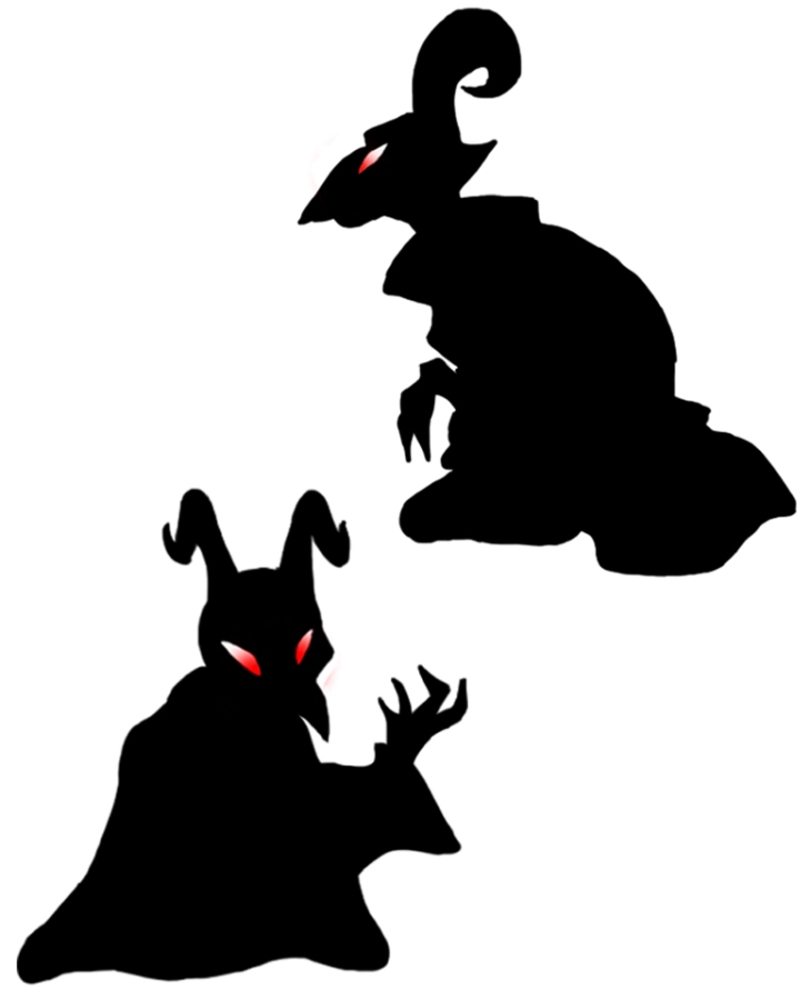
We kept the design relatively simple which I think was the right way to go about it, as we wanted to create the story visually but not over complicate things. We took the idea of silhouette and shadow puppets as it contextually related nicely to animation and it’s history. We created assets as a group and shared them which was also useful to keep a constant style to the animation. I really enjoyed the research side of this project, as I think this is one of my strengths and the subject matter was something I found really interesting. In the future I would like to explore the story and narrative side of things in more detail.
I think what I struggled with the most with this project was using after effects, and I found it frustrating when I what was on the screen wasn’t what I had visualised. Saying this I am very pleased with the progress I have made and I am looking forward to doing more in the future and hopefully getting better.
After many iterations I have finished my section of the motion graphic, and I am rather pleased with it. I think it has many elements that work successfully, such as the pan across at the beginning and the zoom in to the house. I did have help with this, but I think as a learning experience this project has been very successful.
We decided to make the title ‘The Name of The Helper’, to make it more ambitious from the beginning to what fairy tale we were doing. The title relates back to my research right at the beginning, as this is how the original story is classified in the Aarne-Thompson classification system.
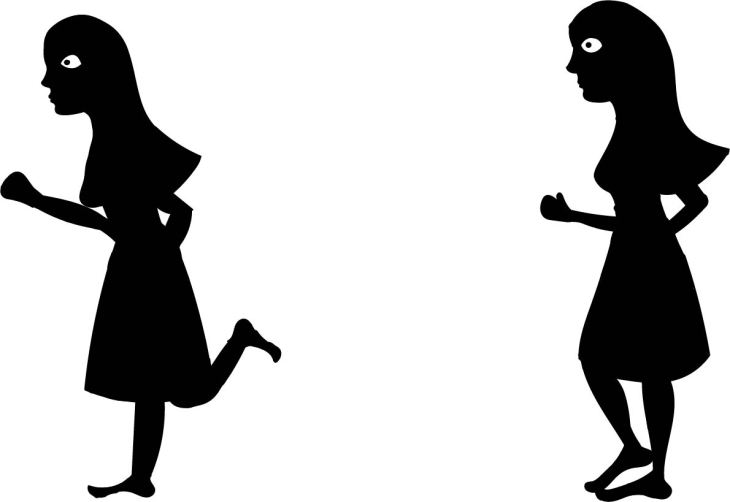
I had some trouble with the hand, and ideally I would like to have this as a moving animation, but this idea came too late and I wish I had given enough time to do this, as I think it would have really pulled it all together. The running girl was somewhat successful, I think it is clear what is happening, but could have been more exaggerated, with more head movement. At some points it looked as if she was floating, but I tried to combat this by adding a black ‘path’ under her feet so she had a surface to move on. On the other hand, I think it really resonates with the shadow puppet idea, as you can see how the different limbs are moving. The hand appearing also alludes to this; the puppet and the puppet master.
I found it somewhat frustrating because I had lots of things I wanted to accomplish but I do not yet have the skills to do, but I feel very optimistic as I did find ways to do many of these things, such as zooming in to the window and creating a moving background. I would be very happy to use after effects again for a project, which is a big step up from how I felt at the beginning of this process. I think that in itself is an achievement.
This week has definitely been the most intense, I began to animate my section of the motion graphic. I came across a few problems, mostly to do with using the software. But I am happy that I found ways around these problems with the help of my group and tutors. We brought all of our sections together and added sound, which really tied the whole thing together. I am very happy with how it has turned out, and it was satisfying to see the progress that has been made in the experimentation reels.
Areas for Development
My next area of development will be to continue getting to know after effects after this project has finished. I will reflect on what I have learnt and try to build on it. I think my skills with in the team have improved, and I am excited to work in this way again.
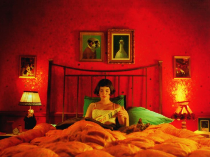
To inform my essay I have looked at a few films that use colour in an interesting way. One that has always interested me is Amelie (2001). The colour in the film almost becomes a character of it’s own, the use of green used sparingly but to pin point key moments. “The director opts for a sort of golden ambiance married with deep, carefully chosen colors. The world of the film thus looks realistic enough, though in an antique sort of way, but also has an unreal “once upon a time” layer covering the realism”
I am now at the mid point of my animation, I think I have made a lot of head way so far but there is more to go. I found that getting some constructive criticism was very helpful, because sometimes it’s hard to pin point why something doesn’t look quite right. Things that were pointed out was the pan at the beginning, as it goes too long so becomes quite fast and isn’t really necessary, so I want to shorten this. It is also a big strange and jarring then the girl appears from in the house. I would like to try and zoom into the window and the pull away with the girl character running, to avoid the strange movement. I think the hand could be moved more in a more interesting manner, I like how the black screen is across by it, but I think this could be made smoother. I am happy the the last two shots of the hair and the tears, they are simple, but transition nicely into the next scene.
I would like to write my essay on the work of Adam Elliot, a personal favourite animator of mine. As a starting point I have compiled some point from various interviews to hear what Elliot says about his own films. This could give me a good starting point for my essay. I have highlighted areas that I could quote in my essay.
Elliot talking about animation in Australia (2009)
2:33 ‘When I was starting out the equipment we needed cost hundreds of thousands of dollars so it was really quite limiting to who could be an animator but now all you needs a digital camera a couple hundred dollars download some software and the computer’
3:05 ‘I think the most rewarding part of being an animator is of course when the films finished and supplement the big screen and the audience is laughing or being moved or being affected in some way, but it’s also the process when I was making my last film (Mary and Max) I was almost disappointed when it got to the end of the making process’
3:53 ‘There’s something about especially 3d animation that I find really magical and enticing‘
1:18 ‘When they (the audience) see an Adam Elliott film what they’re seeing is 100% made in camera in a traditional manner and at every prop set and character that they see has been handcrafted well there’s a few reasons I choose stop-motion animation over CGI and the main reason is because I like using my hands’
2:33′ At the end of the day it’s the story that’s the most important thing with all my films. I’ve always said that I’ve never been obsessed by their length because my films are biographies, I always let the characters tell me how long their stories should be. My first four films were all shorts the first was uncle then cousin then brother and they are all roughly about five minutes in length. They each took about a year to make and after I’d made those three I thought well I feel like I want to explore a biography that’s a bit longer, a bit more challenging. So that’s when we decided to pursue Harvey crumpet and Harvey ended up telling us that his story should be about 23 minutes which was a perfect commercial half hour for SBS television. You know it always focused on one character and I thought well it’s time we decided to make Mary and Max. It is still a biographical but it’s really about two lead characters’
4:02 ‘Animation for some reason that’s over 100 minutes becomes a bit becomes a bit intolerable I think you once you’ve suspended your disbelief for that amount of time in animation it doesn’t work so most animated features are generally under a hundred minutes’
4:36 ‘Once the storyboard and the script are what we call locked off we then move into a very intense pre-production stage that took about six to eight months and that’s where we really planned the aesthetic to the film how detailed we could go with the sets and props and really worked out all the logistics’
0:00 ‘I knew from from day one that I wanted uncle to really the full of poignancy and that’s very hard to do with little clay characters not only did the audience have to suspend their disbelief but they have to believe these little blobs of clay are real people so that when they die the audience empathizes’
0:30 ‘I’m glad that uncle was a film that I had the courage to make in a different manner to the way animated shorts were being made at the time so I certainly think your first film should also be your bravest film and the one in which you take a lot of risks because often down the track you don’t get the chances to take those risks’
Google to look up different motion graphic studios
Development
This week we finalised our script, which I am very happy with. I did a rough recording to get the timing and and it was within the time limit, we then used the recording to help with our animatic. We brought together all our individual animatics and put them in sequence, and as we had already discussed the transitions it worked well. I think we are at a very strong place to start animating, as we have a clear story and all our assets. At the end of the week we re recorded our narration in the sound studio, adding different voices and sound effects. This was very fun and productive, and I think will be an element that will really make our motion graphic stand out.
Areas for Development
My next area of development will be to use all of the resources and pre production skills I have learnt and start animation my section of the motion graphic. It is key that our group stays in contact and discusses our development, to make sure everyone is on target. Once this is complete we will need to make sure we meet and combine all of our 10 second sections and time it correctly with the narration and sound.
My group and I spent a few hours recording and refining our script. We first recorded the over all narration, then the individual characters who speak with in it. After a few takes of each and some tweaking we recording some sound effects, for instance for the punch sound we used a bag of flour being punched. We used the folie mic and box of gravel to create the sound of footsteps.
I have done some research into a few differnt motion graphic companies within the UK. They are almost entirely to do with advertising in some aspect, but overlap into education, entertainment, animation, TV and film. It has shown me that motion graphics is a very broad industry, and one that is currently quite successful in the UK.
“Mainframe is a creative production studio working with forward thinking brands to create innovative commercials and branded content.”
This motion graphic is a compilation of different artists work to show case their abilities, and also demonstrate the uses of MAYA 2018; it is a creative way of showing off an alternative show reel. “We set out to create a selection of experimental, dynamic scenes using simple primitive shapes as the base objects. That original concept stood fast but the process itself also resulted in serving a far higher purpose than pretty pictures alone.”
Although CG is not my area of expertise, I think this shows that even simple shapes can be very interesting and original. The use of sound and a unified colour pallet brings the whole thing together, and is a good example of different artists working with the same vision but each bringing their own take on it.
This company is smaller than the previous, but much more eclectic, their work is incredibly varied. “We do everything from digital strategy, websites, eMarketing, brand development, apps, social media and search marketing through to video production, motion graphics and 3D modelling.”
The video above is more of an infographic, but shows how a simple motion graphic can be used and look sleek and professional. The transitions between images are quick but not too fast so that you don’t absorb the information. I would say the down side of it is that it’s not particularly engaging, which is partly down to the subject matter, but also because it feels quite generic. This isn’t necessarily a bad thing, as I think this kind of corporate motion graphic holds a signifiant place in the kind of work a company might be asked for.
A lot of their animations follow this flat, 2D style. I can assume that this is probably one of the cheaper, and easier ways to create adverts and get information across quickly.
I think that this motion graphic is much more successful than the previous one, but this may just be because more time and money has been given to it. The company says on their website, “We proposed a 120 second, 2D character led animation to voiceover. The sequence presents the ideal scenario at the beginning to grab attention, then examines the limitations of similar systems in the past, before presenting Comprobo as an ideal solution.”
They also put up their character designs and story boards on their website, which I think is something all companies similar to this should be doing. I allows a customer to see the process of what they are paying for. The only down side is that the website itself is very confusing, as I think they are trying to provide too many services and show off too many skills at once.
From this I think that we have taken the right approach with this project by keeping the shapes and colours reasonably simple, but adding detail with the movement and style.
These are the assets that we will be sharing as a group for our animation. They were made by other members of the group (apart from the girl and the hand) so I’m not claiming them as my own work! I think this was an efficient way to do this as it shares the workload and means we are all working from the same material.